WordPress tries to be helpful by automatically making your images responsive. It adds sizes and srcset attributes to each <img> to ensure a properly sized file is used at each screen width. Unfortunately, these values are almost always incorrect.
Even worse, there’s no easy fix. Responsive images are one of those historically complex, oft-misunderstood frontend development topics. Or, at least, they have always been difficult for me to understand. Recently, to solve Google Lighthouse’s “Properly size images” warning for our sites, I jumped in anyway, pushed through the misery, and finally figured out a solution.
What’s happening when Google Lighthouse complains about “Properly size images”
This epic journey all came about because of the “Properly size images” warning in Google Lighthouse. When Google Lighthouse complains your images aren’t properly sized, it’s saying you are using too large of an image file for how the image displays on the page. Google Lighthouse inspects your page in a simulated Moto G4 browser, but the problem can exist across all browser widths.
Let’s dive into a specific example.

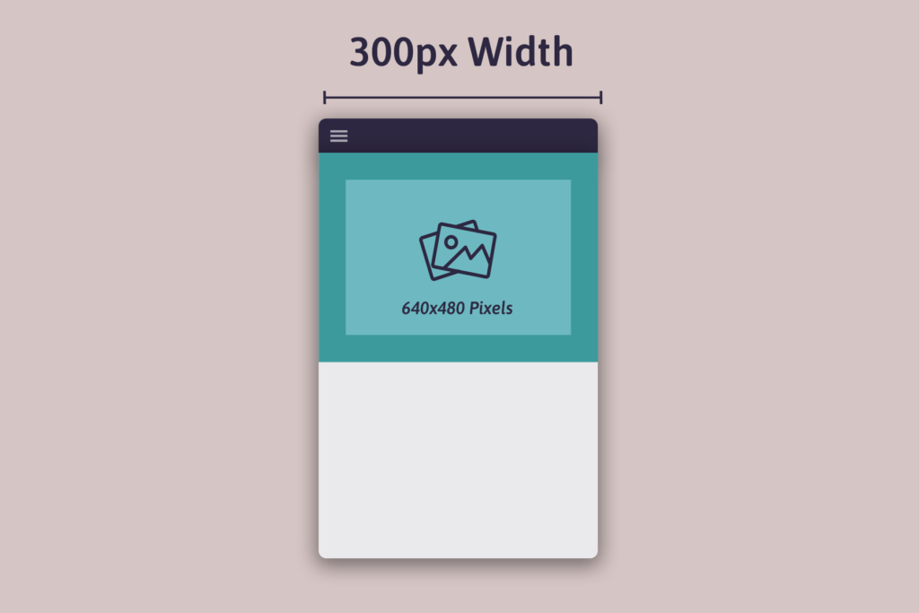
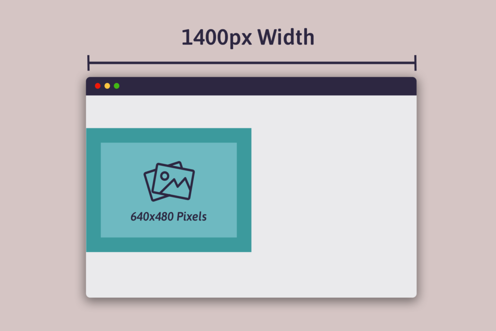
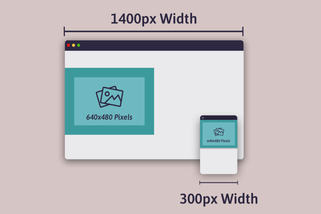
In the example above, the image displays at 300 pixels wide by 200 pixels tall. However, the image file is 640 pixels wide by 480 pixels tall. The image file is too large for the browser viewport. When the size of the actual file exceeds the size of the expected file by 4kb or more, Google Lighthouse flags it as an improperly sized image.
“OK, easy to fix. I will simply resize the image to 300 pixels wide by 200 pixels tall. Boom: problem solved.”

Not so fast! The problem is more complex than that. Because the image appears at various widths as the browser width changes, the file variations you include need to accommodate the responsiveness of the design as well. Additionally, you need to make sure the image has 2x and 3x versions at each browser width for high density displays.
The solution is responsive images, but now you have two problems.
First, start with the sizes attribute
The mistake I’ve always made is to shove more image widths into the srcset attribute and call it a day. I assumed WordPress’ automatically generated sizes attribute was correct, and a manually prepared sizes attribute was a nice optimization.
In reality, having the correct sizes attribute is critical. The sizes attribute tells the browser how the image will be displayed at various browser widths. Only once you have a correct sizes attribute can you know what image widths you need in the srcset attribute.
Let’s look at our prior examples again.

Calculating the sizes attribute requires knowing how the image displays at various browser widths. In the first example, the image displays at 100% of the browser width. Because this is the mobile version, we can use 100vw (100% of the viewport width) as the default value for the sizes attribute: sizes="100vw". In the second example, the image displays at 50% of the browser width. We’ll add it to the sizes attribute with a media query: sizes="(min-width: 1024px) 50vw, 100vw". Simple, right?
Unfortunately, it’s a total pain and relatively error-prone to manually calculate the sizes attribute. Responsive site designs are rarely as simple as the example above. Plus, you’ll likely have a dozen or more images on a page with varying presentations.
Responsive Image Linter saves the day!
Fortunately, an awesome open source project called Responsive Image Linter can calculate the sizes attribute for you. Thank you Russell Heimlich for the tip. Simply install the bookmarklet, run it against the page, and it shows an analysis for each image:

Once you’ve applied the suggested changes, your image will pass the lint:

When I’ve manually calculated the sizes attribute in the past, it was pretty much always wrong. With Responsive Image Linter, I get the sizes attribute correct on the first try!
Second, add srcset widths after the sizes attribute is correct
Now that your sizes attributes are correct, it’s possible to calculate the necessary srcset widths for your images. But what should they be?
Responsive Image Linter saves the day again! A couple weeks ago, I opened an issue suggesting Responsive Image Linter provide recommended widths for srcset images. The maintainer, Martin Auswöger, thought it was a good idea and was open to sponsorship for it.
Responsive Image Linter now suggests recommended widths for srcset images:

Identifying these best widths is more of an art than it is a science. Here’s a summary of how Responsive Image Linter’s algorithm works:
When the linter runs, it resizes the viewport (browser window) to many different dimensions and checks how large each image is for each viewport.
The calculateSuggestedDimenions algorithm then takes this data and searches for image widths that appear often. These sizes are most likely statically sized images (non-fluid) and their exact widths are added to the recommendation list as @1x and @2x versions.
Next, it adds the lowest and largest measured size of the image to the recommendation list too.
From this list it then removes sizes that are less than 0.2 megapixels apart. Gaps in that list of sizes that are larger than 0.75 megapixels get divided into equal parts of less than 0.75 megapixels.
At the end of all of this we get a list of image widths where every gap between them is from 0.2 to 0.75 megapixel large. And for the non-fluid sized parts of an image we have an exact match for @1x and @2x screen resolutions.
As of January 2022, what’s going on in Google Lighthouse is actually much simpler than Responsive Image Linter’s algorithm. When Google Lighthouse shows the “Properly size images” warning, it is only looking at one viewport width (that of the Moto G4). For a given image, Google Lighthouse computes the actual pixels displayed (width and height), compares this value to the total number of pixels in the file, and throws a warning if the difference between the two exceeds the 4kb threshold. This may change in the future.
For additional context, here are a few other helpful links I came across in my research:
- Applying srcset: choosing the right sizes for responsive images at different breakpoints. Some synthetic testing around which are the most commonly used image sizes. The author produced a Vue component to “quickly create responsive image tags with an optimal number of image sources for all devices.” It uses this underlying responsive-image-sizes library.
- Responsive Images 101, Part 9: Image Breakpoints. A canonical article on the topic.
- How do you determine a good set of breakpoints for srcset image sizes. Accepted answer is some real world research into the most common screen resolutions, and image size opinions based on them.
Workflow for solving “Properly size images” in WordPress
The primary pages on our sites now pass the “Properly size images” check. It took a good amount of effort though, so I identified some strategies to streamline the process.
Don’t bother with sizes or srcset until your design is complete
When building a new page, I think it’s best to not bother with the sizes or srcset attributes until the design is complete. Because they will change as the design changes, it’s simply extra work to prematurely optimize your images. Once the page is complete, run Responsive Image Linter to identify the necessary sizes and srcset attributes.
Apply sizes to template images by passing it as an argument:
<?php
echo wp_get_attachment_image(
	$thumbnail_id,
	'thumbnail',
	false,
	[
		'class' => 'rounded-full w-20 md:w-24 h-20 md:h-24 mb-2',
		'sizes' => '(min-width: 780px) 96px, 80px',
	]
);
For images in the post content, you’ll need to filter wp_calculate_image_sizes. I’d suggest adding the filter early on the_content, and then removing it late, to avoid having the filter impact other parts of your theme.
Have a system for generating image width variations
For images hardcoded into the theme template, my preference has always been to commit the images directly into the Git repository. I wrote a little script to streamline the process of creating the necessary image widths:
$ wp tbc generate-image-widths --widths=270,560,890 --compress assets/images/tasty-recipes-sales/cards/elegant.png
Generated elegant-270x325.png (47kb->14kb)
Generated elegant-560x675.png (169kb->48kb)
Generated elegant-890x1073.png (365kb->103kb)
Success: Image widths created.
The --compress flag throws the image against TinyPNG, which somehow is able to magically compress the image much more than WordPress can.
Use just the right amount of add_image_size()
For images embedded into the post content, WordPress will dynamically assign sizes and srcset attributes as the post is rendered.
For the sizes attribute, there’s one thing to be aware of: unless you’d like to calculate the value for each image in the post content, the sizes will almost always be incorrect. Images can be varying widths within the post content. I think the best thing to do is to figure out the sizes attribute for an image that is 100% of the post content width, and use that for all of the images.
For the srcset attribute, WordPress inserts any “thumbnails” (size variations registered with add_image_size() ) that match the proportions of the original image. The defaults are somewhat sufficient out of the box. If they aren’t, your options include:
- Ignore the problem.
- Register more thumbnails with
add_image_size(), and then “regenerate thumbnails” for all of the images in your Media Library. The latter can be hours of script execution on a larger site. - Use an image CDN to dynamically generate additional image widths.
We ended up doing a combination of options 2 and 3. For the most part, I added another image size or two on each site. On Pinch of Yum and Food Blogger Pro, we’re using Cloudflare to dynamically generate a few additional image widths:
add_filter(
	'wp_calculate_image_srcset',
	function( $sources, $size_array, $image_src, $image_meta, $attachment_id ) {
		$full_src = wp_get_attachment_url( $attachment_id );
		if ( ! $full_src ) {
			return $sources;
		}

		$widths = [ 480, 680, 960, 1080 ];
		foreach ( $widths as $width ) {
			if ( isset( $sources[ $width ] )
			|| $width >= $size_array[0] ) {
				continue;
			}
			$url = sprintf(
				'https://pinchofyum.com/cdn-cgi/image/width=%d,height=%s,fit=scale-down/%s',
				$width,
				99999,
				ltrim( wp_parse_url( $full_src, PHP_URL_PATH ), '/' )
			);

			$sources[ $width ] = [
				'url'        => $url,
				'descriptor' => 'w',
				'value'      => $width,
			];
		}
		return $sources;
	},
	10,
	5
);
Et voila! You’ve solved “Properly size images” for your WordPress site.
Made it all of the way to the end? Email [email protected] for a job on our engineering team 🙂